
In today’s digital world, smartphones have become the primary way people browse the internet. Millions of users search on Google, read blogs, shop online, and watch videos directly from their mobile devices. Because of this major shift, search engines now prioritize mobile-friendly websites more than ever before.
If your website is not optimized for mobile users, you may lose traffic, rankings, and even potential revenue. This is where Mobile SEO becomes extremely important. Mobile SEO helps websites perform better on smartphones and tablets, improving user experience and search engine visibility.
For bloggers, businesses, affiliate marketers, and website owners who want better rankings and Google AdSense approval, understanding Mobile SEO is essential. In this article, you will learn what Mobile SEO is, why it matters, important optimization techniques, common mistakes, and how it helps websites grow successfully.
What Is Mobile SEO?
Mobile SEO refers to the process of optimizing a website for mobile devices such as smartphones and tablets. The goal is to ensure that mobile users can access, navigate, and interact with the website easily.
Mobile SEO focuses on improving:
- Website speed
- Mobile responsiveness
- User experience
- Navigation
- Readability
- Technical performance
A mobile-friendly website automatically adjusts its layout and design according to screen size.
Why Is Mobile SEO Important?
Mobile SEO has become one of the most important ranking factors because most internet users now browse websites from mobile devices.
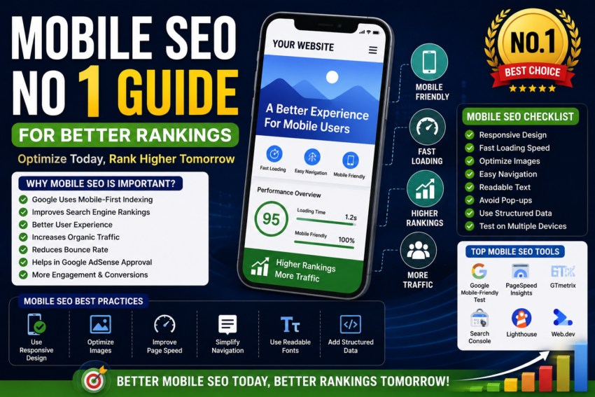
1. Google Uses Mobile-First Indexing
Google uses mobile-first indexing, meaning it primarily evaluates the mobile version of a website for ranking and indexing.
2. Better User Experience
Visitors leave websites quickly if pages load slowly or look broken on mobile devices.
3. Higher Search Rankings
Mobile-friendly websites perform better in Google search results.
4. Increased Website Traffic
Optimized mobile experiences encourage users to stay longer and explore more pages.
5. Supports Google AdSense Approval
Google prefers websites with good mobile usability and clean navigation.
What Is Mobile-First Indexing?
Mobile-first indexing means Google mainly uses the mobile version of a website to determine rankings.
Previously, Google evaluated desktop versions first. However, because mobile usage has grown rapidly, Google now prioritizes mobile experiences.
This means:
- Poor mobile design can hurt rankings
- Slow mobile pages reduce visibility
- Mobile optimization directly affects SEO
Characteristics of a Mobile-Friendly Website
A mobile-friendly website should provide smooth experiences across all screen sizes.
Responsive Design
Responsive websites automatically adapt to different devices.
Fast Loading Speed
Pages should load quickly on mobile networks.
Easy Navigation
Menus and buttons should be easy to tap.
Readable Text
Users should not need to zoom in to read content.
Optimized Images
Images should load quickly without reducing quality.
Responsive Web Design
Responsive design is one of the most important parts of Mobile SEO.
A responsive website automatically adjusts:
- Layout
- Images
- Text size
- Navigation
- Buttons
This improves usability across smartphones, tablets, and desktops.
Responsive design also reduces duplicate content issues because the same URL works on all devices.
Importance of Website Speed in Mobile SEO
Mobile users expect websites to load quickly. Slow-loading websites increase bounce rates and reduce rankings.
Factors That Affect Speed
- Large image sizes
- Heavy scripts
- Poor hosting
- Too many plugins
- Unoptimized code
Benefits of Faster Websites
- Better user experience
- Higher search rankings
- Increased engagement
- Improved conversion rates
How to Improve Mobile Website Speed
Compress Images
Large images slow down websites. Use optimized image formats and compression tools.
Use Caching
Caching stores website data temporarily, reducing loading time.
Minimize CSS and JavaScript
Reducing unnecessary code improves performance.
Choose Fast Hosting
Reliable hosting providers improve website speed and stability.
Use Content Delivery Networks
CDNs distribute website files globally for faster loading.
Mobile SEO and User Experience
User experience is closely connected to SEO performance.
Google wants users to have positive browsing experiences. Websites that frustrate visitors often rank lower.
Important User Experience Factors
- Easy navigation
- Clear fonts
- Simple design
- Fast loading pages
- Mobile-friendly buttons
A clean mobile interface improves visitor satisfaction.
Mobile SEO Best Practices
Use Responsive Themes
Choose responsive website templates and themes.
Optimize Fonts
Use readable font sizes for mobile screens.
Avoid Pop-Ups
Large pop-ups can create poor mobile experiences.
Improve Navigation
Use simple menus and clear navigation structures.
Optimize Images
Use lightweight and responsive images.
Test Mobile Compatibility
Regularly test websites on multiple devices.
Mobile SEO and Google AdSense Approval
Many websites fail AdSense approval because of poor mobile experiences.
Professional Website Appearance
Mobile-friendly websites look more trustworthy and modern.
Better User Engagement
Users stay longer on optimized websites.
Improved Navigation
Easy navigation helps visitors access content quickly.
Reduced Bounce Rates
Visitors are less likely to leave fast-loading mobile websites.
Better Content Accessibility
Mobile SEO helps Google crawl and understand website pages efficiently.
Common Mobile SEO Mistakes
Slow Mobile Pages
Large files and poor optimization reduce performance.
Non-Responsive Design
Websites that do not adapt to mobile devices perform poorly.
Tiny Text Sizes
Unreadable text creates frustration for users.
Difficult Navigation
Complicated menus hurt user experience.
Blocking CSS or JavaScript
Blocked resources can affect Google’s ability to render pages.
AMP and Mobile SEO
AMP stands for Accelerated Mobile Pages.
AMP is a framework designed to create extremely fast-loading mobile pages.
Benefits of AMP
- Faster page loading
- Better mobile performance
- Improved user experience
Disadvantages of AMP
- Limited design flexibility
- Additional technical setup
Although AMP can improve speed, many modern responsive websites perform well without it.
Mobile SEO Tools
Several tools help website owners improve mobile optimization.
Google Mobile-Friendly Test
Checks if websites are mobile-friendly.
Google PageSpeed Insights
Analyzes website speed and performance.
Google Search Console
Monitors mobile usability issues.
GTmetrix
Provides detailed website speed reports.
Lighthouse
Evaluates website performance and accessibility.
Mobile SEO for Bloggers
Bloggers can benefit greatly from mobile optimization because many readers use smartphones.
Benefits Include
- Better search rankings
- More page views
- Improved engagement
- Higher ad revenue
- Better reader experience
Mobile-friendly blogs usually perform better overall.
Mobile SEO for E-Commerce Websites
Online stores rely heavily on mobile users.
Important E-Commerce Mobile SEO Tips
- Simplify checkout processes
- Optimize product images
- Improve page speed
- Use mobile-friendly navigation
- Make buttons easy to tap
Good mobile experiences increase sales and customer satisfaction.
Voice Search and Mobile SEO
Voice search is growing rapidly because many users search using smartphones and virtual assistants.
Voice Search Optimization Tips
- Use natural language
- Target question-based keywords
- Optimize for local SEO
- Improve page speed
Voice search will likely become more important in the future.
Future of Mobile SEO
Mobile SEO continues evolving as technology changes.
Future trends may include:
- AI-powered search experiences
- Faster mobile technologies
- Better voice search optimization
- Advanced mobile usability signals
- Improved user behavior analysis
Websites that prioritize mobile experiences will continue performing better.
Tips for Long-Term Mobile SEO Success
Publish High-Quality Content
Good content remains essential for SEO success.
Monitor Website Performance
Regularly check speed and usability reports.
Keep Designs Simple
Minimal designs often perform better on mobile devices.
Update Website Software
Updated plugins and themes improve security and performance.
Focus on User Needs
Always prioritize visitor experience over complicated designs.
Conclusion
Mobile SEO is no longer optional in modern digital marketing. With most users browsing the internet through smartphones, websites must provide fast, responsive, and user-friendly mobile experiences.
A well-optimized mobile website improves search rankings, increases organic traffic, reduces bounce rates, and supports Google AdSense approval. Responsive design, fast loading speed, easy navigation, and optimized content all play major roles in mobile SEO success.
For bloggers, businesses, affiliate marketers, and website owners who want long-term growth, investing time in Mobile SEO is one of the smartest decisions possible. Combined with quality content and proper SEO practices, Mobile SEO can significantly improve website performance and online success over time.